
Alerts
An alert can be used to notify user about something important without interupting the user experience
Standard alerts
The alert component has four variants alert-success, alert-danger, alert-warning & alert-info
            <div class="alert alert-success">This is success alert</div>
            <div class="alert alert-danger">This is danger alert</div>
            <div class="alert alert-warning">This is warning alert</div>
            <div class="alert alert-info">This is info alert</div>
Avatars
An avatar is a representation of who we are or our fictional character, which can be used to represent user's profile pic.
The avatar component has 5 sizes, avatar-xl (4em), avatar-lg (3em), avatar-std (2em) avatar-sm (1.5em), and avatar-xs (1em).
              //extra large avatar
              <figure class="avatar avatar-xl">
              <img src="..." alt="">
              </figure>

              //large avatar
              <figure class="avatar avatar-lg">
                <img src="..." alt="">
              </figure>

              //medium avatar
              <figure class="avatar avatar-md">
                <img src="..." alt="">
              </figure>

              //small avatar
              <figure class="avatar avatar-sm">
                <img src="..." alt="">
              </figure>

              //extra small avatar
              <figure class="avatar avatar-xs">
                <img src="..." alt="">
              </figure>
Badges
Badges are small components on websites that are used to display count or status of a user.
Avatars With Badges
The badge component can be used with and without the count.
      //big avatar with badge
      <figure class="avatar avatar-xl ">
        <img src="..." alt="">
        <div class="badge-count badge-near">1</div>
      </figure>

      //medium avatar with badge
      <figure class="avatar avatar-lg ">
        <img src="..." alt="">
        <div class="badge-count badge-normal">1</div>
      </figure>

      //small avatar with badge
      <figure class="avatar avatar-md ">
        <img src="..." alt="">
        <div class="badge-count badge-near">1</div>
Icons With Badges
The icons can be used with and without the badge.
          <figure class="icon icon-cart ">
          <div> <i class="fa-solid fa-cart-shopping"></i></div>
            <div class="badge-count">1</div>
          </figure>

          <figure class="icon icon-wishlist ">
            <i class="fa-solid fa-bookmark"></i>
            <div class="badge-count">1</div>
          </figure>

          <figure class="icon icon-notification ">
            <i class="fa-solid fa-bell"></i>
            <div class="badge-count">1</div>
          </figure>
Buttons
Buttons, aka CTAs, are an integral part of websites, and are used on forms, webpages, dialog boxes, and input feilds
Solid buttons
The solid button component is available in three variants btn-primary, btn-secondary and btn-danger.
            <div class="button button-primary">Primary</div>
            <div class="button button-secondary">Secondary</div>
            <div class="button button-danger">Warning</div>
Link Buttons
The link button component is available in three variants btn-primary, btn-secondary and btn-danger.
              <div class="button button-primary button-link">Primary</div>
              <div class="button button-secondary button-link">Secondary</div>
              <div class="button button-danger button-link">Warning</div>
Buttons With Icons
              <div class="button button-icon"> <img src="...">  <span> Add To Cart </span> </div>
              <div class="button button-icon">  <img src="...">  <span> Buy Now </span> </div>
Floating Action Button
              <div class="floating-action-button-component">
              <button class="fab"> <img src="..."></button>
              </div>
Cards
Cards are an essential feature of modern web apps, which can be used to show product details, video details or user details.
Card With Badge
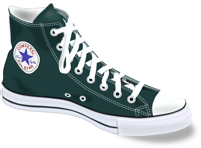
Converse
Men High Top Shoes
₹1299 ₹1599
              <div class="card">
                <div class="card-image-with-badge">
                  <img class="card-image" src="./images/shoe.png" alt="" />
                  <figure>
                    <i class="fa-solid fa-heart"></i>
                  </figure>
                </div>
                <div class="card-description">
                  <h2>Converse</h2>
                  <p>
                    Men High Top Shoes
                  </p>
                  <p>
                    ₹1299 <strike class="card-strk">₹1599</strike>
                  </p>
                  <div class="card-buttons">
                    <div class="button button-icon"> <i class="fa-solid fa-cart-shopping"></i>  Add To Cart
                      </span> </div>
                    <div class="button button-icon"> <i class="fa-solid fa-bag-shopping"></i> Buy Now </span>
                    </div>
                  </div>
                </div>
              </div>
Card With Dismiss
Converse
Men High Top Shoes
₹1299 ₹1599
              <div class="card">
                 <div class="card-image-with-dismiss">
                   <img class="card-image" src="./images/shoe.png" alt="" />
                   <figure>
                     <i class="fa-solid fa-xmark"> </i>
                   </figure>
                   <div class="card-description">
                     <h2>Converse </h2>
                     <p>
                      Men High Top Shoes
                     </p>
                     <p>
                      ₹1299  <strike class="card-strk">₹1599 </strike>
                     </p>
                     <div class="card-buttons">
                       <div class="button button-icon">  <i class="fa-solid fa-cart-shopping"> </i>  <span> Add To Cart
                         </span>  </div>
                       <div class="button button-icon">  <i class="fa-solid fa-bag-shopping"> </i> <span> Buy Now  </span>
                       </div>
                     </div>
                   </div>
                 </div>
               </div>
Card With Text Overlay
                 <div class="card">
                  <div>
                    <img class="card-image" src="./images/shoe.png" alt="" />
                    <div class="card-description card-text-overlay">
                      <h2>Converse</h2>
                      <p>
                        Men High Top Shoes
                      </p>
                      <p>
                        ₹1299 <strike class="card-strk">₹1599</strike>
                      </p>
                    </div>
                    <div class="card-buttons card-buttons-light">
                      <div class="button button-icon"> <i class="fa-solid fa-cart-shopping"></i> <span> Add To Cart
                        </span> </div>
                      <div class="button button-icon"> <i class="fa-solid fa-bag-shopping"></i><span> Buy Now </span>
                      </div>
                    </div>
                  </div>
                </div>
Card With Text
Lorem ipsum dolor sit amet consectetur adipisicing elit. Sequi unde ab eos porro quod quas adipisci deserunt velit pariatur.
                 <div class="card card-with-text">
                   <div>
                     <div class="card-description">
                       <p>Lorem ipsum dolor sit amet consectetur adipisicing elit. Sequi unde ab eos porro quod quas adipisci
                        deserunt velit pariatur.  </p>
                       <div class="card-buttons">
                         <div class="button">  <span> I Agree
                           </span>  </div>
                       </div>
                     </div>
                   </div>
                 </div>
Card With Shadow
Converse
Men High Top Shoes
₹1299 ₹1599
Converse
Men High Top Shoes
₹1299 ₹1599
Converse
Men High Top Shoes
₹1299 ₹1599
               <div class="card card-shadow">
                 <div>
                   <img class="card-image" src="./images/shoe.png" alt="" />
                   <div class="card-description">
                     <h2>Converse </h2>
                     <p>
                      Men High Top Shoes
                     </p>
                     <p>
                      ₹1299  <strike class="card-strk">₹1599 </strike>
                     </p>
                     <div class="card-buttons">
                       <div class="button button-icon">  <i class="fa-solid fa-cart-shopping"> </i>  <span> Add To Cart
                         </span>  </div>
                       <div class="button button-icon">  <i class="fa-solid fa-bag-shopping"> </i> <span> Buy Now  </span>
                       </div>
                     </div>
                   </div>
                 </div>
               </div>
Vertical Card
Converse
Men High Top Shoes
₹1299 ₹1599
Converse
Men High Top Shoes
₹1299 ₹1599
Converse
Men High Top Shoes
₹1299 ₹1599
              <div class="cards-container">
                <<div class="card card-vertical">
                  <<img class="card-image" src="./images/converse-vertical.jpg" alt="" />
                    <<div class="card-description">
                      <<h2>Converse<</h2>
                      <<p>
                        Men High Top Shoes
                      <</p>
                      <<p>
                        ₹1299 <<strike class="card-strk">₹1599<</strike>
                      <</p>
                      <<div class="card-buttons">
                        <<div class="button button-icon"> <<i class="fa-solid fa-cart-shopping"><</i> <<span> Add To Cart
                          <</span> <</div>
                        <<div class="button button-icon"> <<i class="fa-solid fa-bag-shopping"><</i><<span> Buy Now <</span>
                        <</div>
                      <</div>
                    <</div>
                  <</div>
Horizontal Card
Converse
Men High Top Shoes
₹1299 ₹1599
50% off
               <div class="card card-horizontal">
                <div class="card-image">
                  <img src="./images/shoe.png" alt="" />
                </div>
                <div class="card-description">
                  <h2>Converse</h2>
                  <p>
                    Men High Top Shoes
                  </p>
                  <p>
                    ₹1299 <strike class="card-strk">₹1599</strike>
                  </p>
                  <p class="text-md text-grey">
                    50% off
                  </p>

                  <div class="card-quantity">

                    <button>+</button>
                    <span>1</span>
                    <button>-</button>
                  </div>
                  <div class="card-buttons ">
                    <div class="button button-icon"><i class="fa-solid fa-trash-can"></i> <span> Remove From Cart
                      </span> </div>
                    <div class="button button-icon"> <i class="fa-solid fa-angle-right"></i><span> Move to
                        wishlist </span>
                    </div>
                  </div>
                  </div>
              </div>
            </div>
Images
Images are, needless to say, one of the most important components on any website.
Responsive Image
Add the img-res class to make the image responsive

<img class="image-res" src="..." alt="">
Round Image
Add the img-round class to make the image round.

<img class="image-round" src="..." alt="">
Input
Input fields aid in collecting information from the vistors of the webpage, and also to send the provided info to a database.
Standard Input
        <div class="input">
        <input type="text" placeholder="Enter The Text" />
        </div>
Inputs With Validation
There are 3 types of inputs available depending on the state input-err, input-warn and input-succ.
        //for error input
         <input class="input input-error" type="text" placeholder="Error..." />

         //for warning input
         <input class="input input-warn" type="text" placeholder="Warning..." />


         //for success input
         <input class="input input-succ" type="text" placeholder="Success" />
Lists
Lists are another essential part of websites that can be used in nav bar, dropdown menus, article pages, etc.
Ordered List
For an ordered list, class ordered-list can be used
- Hello
- Hello
- Hello
- Hello
- Hello
        <ol class="ordered-list">
          <li class="text-md text-primary">Hello</li>
          <li class="text-md text-primary">Hello</li>
          <li class="text-md text-primary">Hello</li>
          <li class="text-md text-primary">Hello</li>
          <li class="text-md text-primary">Hello</li>
        </ol>
Unordered List
For an unordered list, class unordered-list can be used
- Hello
- Hello
- Hello
- Hello
- Hello
        <ul class="unordered-list">
          <li class="text-md text-primary">Hello</li>
          <li class="text-md text-primary">Hello</li>
          <li class="text-md text-primary">Hello</li>
          <li class="text-md text-primary">Hello</li>
          <li class="text-md text-primary">Hello</li>
        </ul>
Checkbox List
For a list with checkboxes, class checkbox-list can be used
- checkbox 1
- checkbox 2
- checkbox 3
- checkbox 4
        <ul class="checkbox-list">
          <li class="text-md text-primary"><input type="checkbox"> checkbox 1</li>
          <li class="text-md text-primary"><input type="checkbox"> checkbox 2</li>
          <li class="text-md text-primary"><input type="checkbox"> checkbox 3</li>
          <li class="text-md text-primary"><input type="checkbox"> checkbox 4</li>
        </ul>
Stacked List
John Doe Sent You A Friend Request
5 mins ago
John Doe Commented On Your Picture
15 mins ago
John Doe Tagged You In A Post
5 mins ago
        <div class="stacked-li">
        <div class="notification">
          <figure class="avatar avatar-md">
            <img src="./images/avatar-md.png" alt="">
          </figure>
          <div class="notification-info">
            <p class="text-primary text-md">John Doe Sent You A Friend Request</p>
            <p class="text-grey text-sm">5 mins ago</p>
          </div>
        </div>
        </div>
Typography
Text utilities helps one maintain a consistent style and tyopography throught the different sections of a website.
Headings
For headings, h1, h2, h3, h4, h5, h6 tags can be used. The same font-styling is present for class names h1, h2, h3, h4, h5, h6 class.
Heading 1
Heading 2
Heading 3
Heading 4
Heading 5
Heading 6
              <h1 class="h1">Heading 1</h1>
              <h2 class="h2">Heading 2</h2>
              <h3 class="h3">Heading 3</h3>
              <h4 class="h4">Heading 4</h4>
              <h5 class="h5">Heading 5</h5>
              <h6 class="h6">Heading 6</h6>
Text
Paragraphs come in 3 styles: text-lg, text-md, text-sm
This is paragraph
This is paragraph
This is paragraph
              <p class="text-lg">This is paragraph</p>
              <p class="text-md">This is paragraph</p>
              <p class="text-sm">This is paragraph</p>
Alignment
Text can be aligned using the classes align-left, align-center, align right
Text align left
Text align center
Text align right
              <h3 class="align-left">Text align left</h3>
              <h3 class="align-center">Text align center</h3>
              <h3 class="align-right">Text align right</h3>
Styles
Different styles can be added to texts using classes text-primary, text-grey, text-underline, text-strikethrough and text-wavy
Text Primary
Text Grey
Text Underline
Text Strikethrough
Text Wavy
              <p class="text-md text-primary">Text Primary
              <p class="text-md text-grey">Text Grey</p>
              <p class="text-md text-underline">Text Underline</p>
              <p class="text-md text-strikethrough">Text Strikethrough</p>
              <p class="text-md text-wavy">Text Wavy</p>
Modal
A modal box is a scripted effect that allows you to overlay a small element over a website
                <button class="button button-primary" id="open-modal">Open Modal</button>

                <div id="myModal" class="modal">

                <div class="modal-content">
                <span class="close">×</span>
                <p class="text-lg text-primary align-center">You have opened Modal.</p>
                </div>

                </div>
const modal = document.getElementById("myModal");

const modalButton = document.getElementById("open-modal");

const span = document.getElementsByClassName("close")[0];

modalButton.onclick = function () {
  modal.style.display = "block";
};

span.onclick = function () {
  modal.style.display = "none";
};

window.onclick = function (event) {
  if (event.target == modal) {
    modal.style.display = "none";
  }
};
Toast
Toasts are lightweight notifications designed to mimic the push notifications that have been popularized by mobile and desktop operating systems.
This is toast
HTML
              <button onclick="showToast()" class="button button-primary">Show Toast </button>
              <p id="toast-component" class="text-primary align-center">This is toast</p>
JavaScript
              function showToast() {
                let x = document.getElementById("toast-component");

                x.className = "show";
                setTimeout(function () {
                  x.className = x.className.replace("show", "");
                }, 3000);
              }
Rating
Rating users to easily view and set ratings that reflect degrees of satisfaction with content and services.
              <span class="fa fa-star checked"></span>
              <span class="fa fa-star checked"></span>
              <span class="fa fa-star checked"></span>
              <span class="fa fa-star"></span>
              <span class="fa fa-star"></span>
Grid
The CSS Grid Layout Module offers a grid-based layout system, with rows and columns, making it easier to design web pages without having to use floats and positioning.
Grid 2
Grid content here...
Grid content here...
Grid content here...
Grid content here...
Grid 3
Grid content here...
Grid content here...
Grid content here...
Grid content here...
Grid content here...
Grid content here...
              <h3 class="h3">Grid 2</h3>

              <div class="grid grid-2">
                <div>
                  <h6>Grid content here...</h6>
                </div>
                <div>
                  <h6>Grid content here...</h6>
                </div>
                <div>
                  <h6>Grid content here...</h6>
                </div>
                <div>
                  <h6>Grid content here...</h6>
                </div>
              </div>

              <h3 class="h3">Grid 3</h3>

              <div class="grid grid-3">
                <div>
                  <h6>Grid content here...</h6>
                </div>
                <div>
                  <h6>Grid content here...</h6>
                </div>
                <div>
                  <h6>Grid content here...</h6>
                </div>
                <div>
                  <h6>Grid content here...</h6>
                </div>
                <div>
                  <h6>Grid content here...</h6>
                </div>
                <div>
                  <h6>Grid content here...</h6>
                </div>
              </div>
Range Slider
A range slider is an input field that merchants can use to select a numeric value within a given range
              <div class="slider-container">
                <input type="range" min="1" max="100" value="50" class="slider" id="myRange">
              </div>